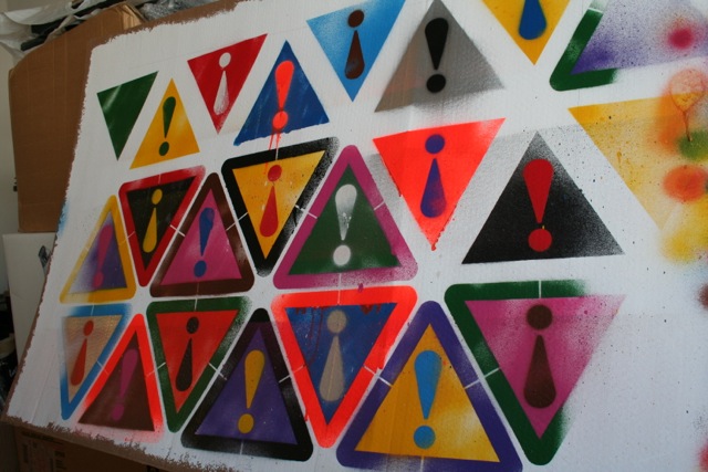
For the last couple of weeks I’ve been working on a painting titled ‘Attention Seeker’. As I said in my previous post from my tutorial notes this was originally digitally designed as a vector illustration, and is something I’ve wanted to create an ‘analogue’ version of for some time.

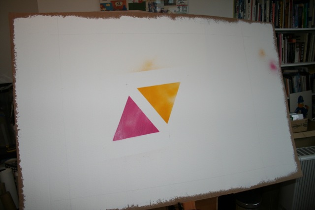
I amended the design in order to ‘make it make-able’, rearranging the triangles into a more ordered tessellation. This is because each stencil is held in place by three pins at each point of the triangle. I prepared the final artwork and cut out the stencils using the college’s laser cutter.
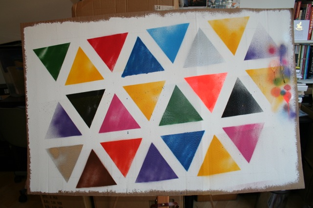
While I intended to paint this directly onto a large (80x60cm) canvas I decided to do a rough version (or I guess you could call it a ‘study’) on cardboard first. I’m pleased I did so as there are a few things I would change for the ‘final’ version.
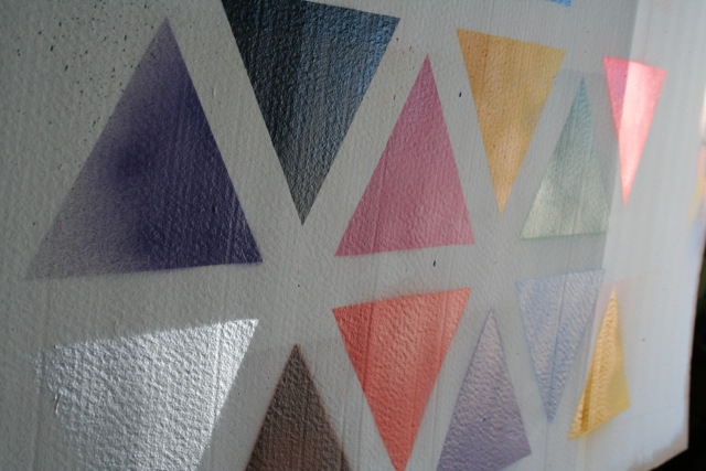
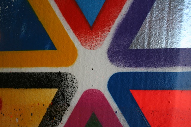
It was good to see what a difference it makes to see the image emerge using real paint and at a large scale. Since I am using metallic and fluorescent paints the effects this gives in different light conditions is impossible to see on screen.
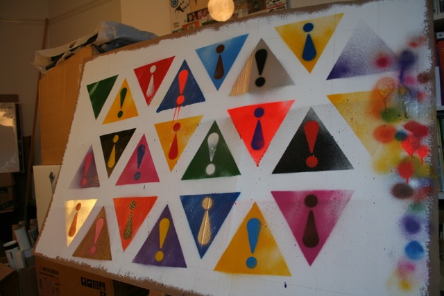
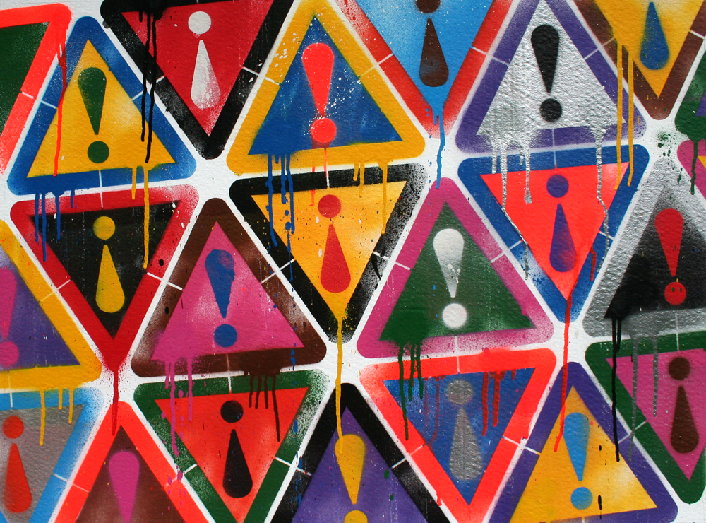
Part of the point of this piece is to illustrate the dichotomy between “…fixed/fluid; precision/accident — and preconceived (tightly controlled, digital vector illustration) as opposed to random (messy, drippy, analogue)”. I’ve been thinking a lot about this while making it and realise how controlled much of the ‘random’ elements remain.
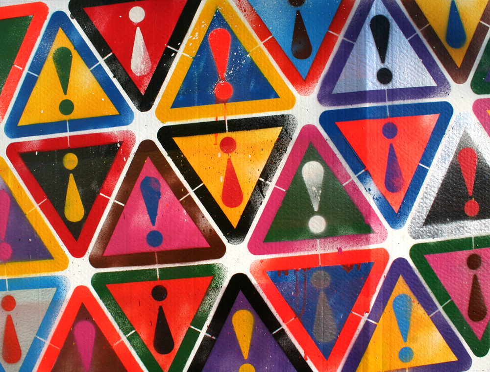
In particular I discussed with Jonathan whether or not to add drips, so I decided to do a ‘before and after’ to help make these decisions.

